When I started Notes From A B. Tech Brain, I didn’t think of it as a “brand”. It was more like a space I wanted to build for myself. Somewhere I could put down everything that was going on in my head.
That’s why the first logo was digital art, not something clean or minimal.
It had a laptop with “Loading…” because that’s exactly how I felt at the time. I wasn’t ready, I didn’t have a fixed niche, and I didn’t want to pretend I did. “Loading…” was me saying that this was still forming, and that was allowed.
The notebook listed things like soft skills, programming, college life, blogs. Not because I was confused, but because I didn’t want to narrow myself too early. I wanted room to explore without being boxed into one identity.
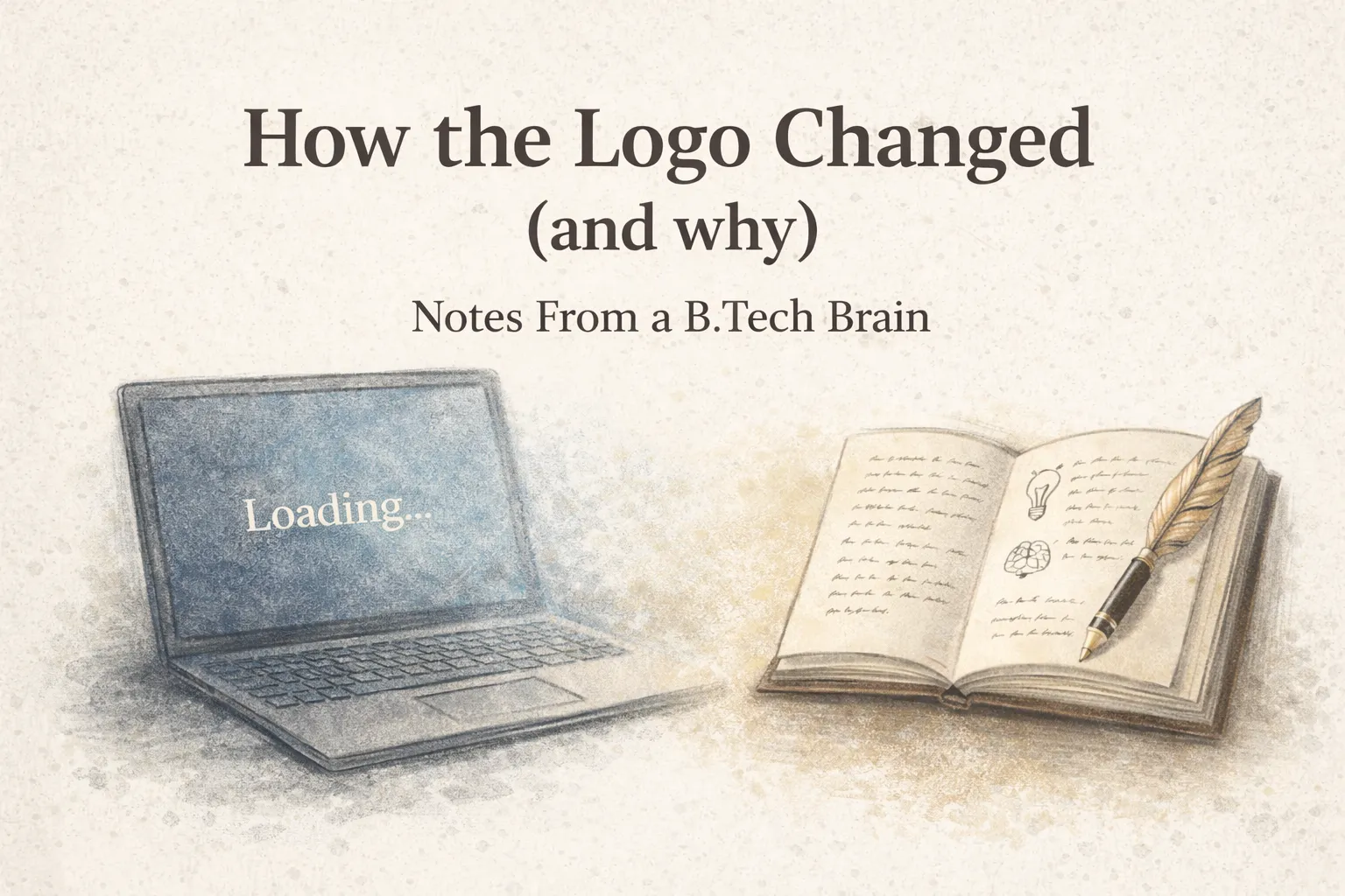
 The OG Logo
The pen, ink, brain, lightbulb. All of it was basically an inventory of what lived in my mind then. The logo wasn’t polished, but it was honest. It helped me start without pressure.
The OG Logo
The pen, ink, brain, lightbulb. All of it was basically an inventory of what lived in my mind then. The logo wasn’t polished, but it was honest. It helped me start without pressure.
Why it stopped feeling right
Over time, my writing changed.
I wasn’t just dumping thoughts anymore. I was sitting with them longer. Thinking more clearly. Writing with more intention.
The logo still represented a version of me that was just beginning. Curious, a little scattered, figuring things out publicly. That didn’t match the work anymore.
It didn’t feel wrong. It just didn’t feel aligned.
How the new logo idea came up
The new logo idea came from thinking about how I actually work now.
Most of my thinking still starts digitally. On a laptop, reading, researching, noticing patterns. But the real clarity happens when I slow down and write. That’s where things settle. That’s where ideas turn into something I can stand by.
That’s why the idea became a laptop turning into a notebook.
 The screen represents the digital world. Tech, information, ideas coming in. The notebook and fountain pen represent reflection. Processing those ideas in my own way and turning them into writing.
Instead of showing everything inside my head, the focus shifted to how ideas move through it.
That’s also why the “Loading…” changed. I’m not waiting to start anymore. I’m already in it.
Why I chose to change it now
I didn’t change the logo because of aesthetics or a new year reset.
I changed it because the old logo belonged to a phase where I was giving myself permission to begin. The new one reflects a phase where I’m more grounded in my voice. Still learning, still thinking, but with more clarity.
The logo needed to grow with that.
That’s it for this one.